Visual Identity
British Heart Foundation
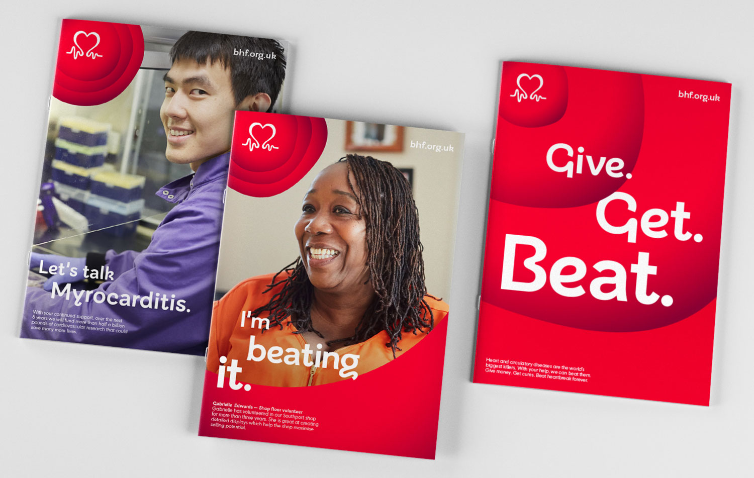
Working with strategic brand consultancy Wolff Olins, I helped develop a modern and friendly creative expression to bring the BHF’s new brand proposition to life. Inspired by the circulatory system, we created a dynamic visual system that illustrated how the BHF keeps hearts beating and blood flowing. The iconic pulse logo was refreshed with energetic beats to form the ‘Big Beat’, a flexible design element that adapts across contexts. We also introduced a bespoke typeface, ‘BHF Beats’, which added warmth and personality. Following the rebrand, the BHF saw increased public trust and was described as ‘supportive’, ‘compassionate’ and ‘friendly’.